As you may have noticed here at Innerspace Marketing, I've been ramping up my YouTube channel marketing.
YouTube is the #2 search engine (behind the #1 big daddy Google)–ahead of Bing, Yahoo, Ask and AOL combined. There is unlimited potential in leveraging YouTube for your marketing efforts, and you may tap into an audience that otherwise would be missed. As much as I love the written word, our world is moving at a rapid pace. Searching through blogs and articles can be time consuming, but watching a video (especially a short one) can give you instant information access.
In my process of giving my YouTube channel a makeover–I was prompted by YouTube to switch to the One Channel format. Okay, what's all this about I thought? I was hoping that YouTube wasn't going the way of Facebook and just changing things willy-nilly.
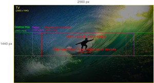
Basically, One Channel displays your channel across all different types of devices–much like responsive web design. In YouTube's case, it takes television into consideration, so that means your channel art must be HUGE to accommodate TV screen rations (16:9). The One Channel art specs are 2560 px by 1440 px. Unlike other social media channels who's profile art specs are a total mystery until some user steps up and gives you that information (Facebook–I'm talkin' to you), YouTube actually provides some art specs for you with a dandy surfer image in their help section.

Hooray! I don't need an archeology degree to find what I need to design artwork–or so I thought. Here's the thing. The guide image they provide is really 2337px x 1273px–close to scale, but not true to size. Now this wouldn't be a huge deal if they gave you the information on how far down the top and how far up from the bottom your “banner” of content/logo will be. Missing information. Not really a true to size guide. Not very helpful at all YouTube. Don't make me do math. That's just plain mean.
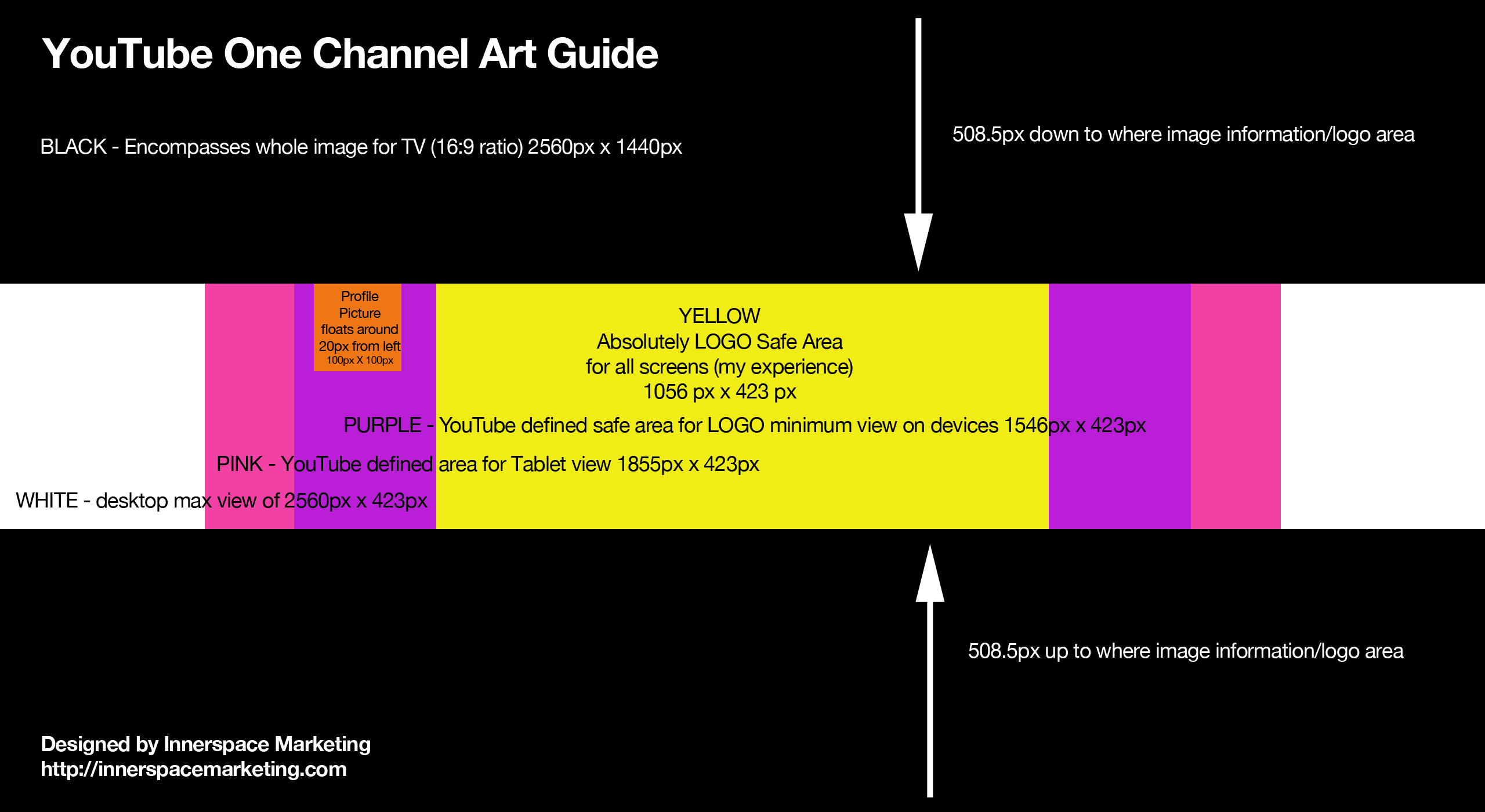
Never fear, dear friend, I have created a guide for you with missing information provided. It's 508.5 pixels down from the top and 508.5 pixels up from the bottom so now you don't have to struggle like I did to get the thing to align properly.
You'll notice I have an extra content area in yellow. This is where I found the best place for my logo to work–you may have to play around within the confines of 423px height to make yours work best. Remember that your profile photo will show up on top of your channel art–usually around 20 pixels from the left edge, so leave a space for that.
And so, without further delay, here is a PNG file for the channel art guide that I created. Please feel free to share it, pin it, and beat me up over it. Okay, maybe not that last one–I bruise easily. And yes, it's a big one. Right click and Save the image, or you can click on it to open in a new browser window and right click/save image as from there.
And just for your visual pleasure, I'm including this awesome Infographic from ShortyMedia about the history of YouTube and where it stands today.
If you haven't secured your YouTube account name for your business, I encourage you to do so right now. Take action and start thinking about ways you can be of value to your customers through short, informative videos! As always, I welcome your comments below.


